
Disciplinary Trends
I have recently been thinking about how a discipline changes across the years. Watching such changes over the course of a long career must be simultaneously bewildering and exciting. Give a long-enough timeframe, it is easy to pick the landmark papers or ideas which have shifted the field. Noam Chomsky’s 1967 review of Skinner’s book on verbal behavior, Green & Swets’ book on signal detection theory, Kahneman & Tversky’s work on decision making are just a few obvious examples. However, identifying these things as they happen is not always quite as easy. From my perspective, it seemed to me like psychology had some pretty groundbreaking stuff happening when I was in grad school, and so I thought I would investigate how interest in certain topics may have waxed or waned in the last few years.
To investigate this idea, I thought I’d start at a very basic level - getting the count of the number of publications which turn up when searching for a given term (e.g. affect). I first tried this with google scholar, but google scholar lacks a dedicated api, and there there is no easy way to scrape the webpage for results. Furthermore, the returned results from google scholar are too broad. The results would have been noisier than they should be, and so I looked around for something else.
It turns out that Scopus has a pretty good web interface which minimizes the hassle of retrieving this type of data. Searching for some term will lead you to a page that looks like this:
Looking to the top, we see a very welcome button: Analyze search results. Yes, I’ll have one of those, please! Following that takes you to a page which allows you to explore the data interactively, as well as download a csv. So, that’s what I did. I created a file which contained the number of search results within psychology for a number of different search terms. In particular, I obtained results for each of the following terms:
- Affect
- Aggresi*
- Attitude OR Belief
- Cheat
- Cultur*
- Deceit*
- Deception
- Dishonest
- Group
- Honest OR Honesty
- Influence OR Persuasion
- Lie*
- Lying
- Moral*
- Self*
- Social*
It should be said that I had a pretty specific hypothesis going into this, but I’ve found some odd stuff in the data. I’m not really sure where it comes from yet, so this is just an initial exploration.
First, we import our needed modules.
import pandas as pd
import numpy as np
from ggplot import *

%matplotlib inline
Next, I get the location of the file on disk and read it in. I also rename one of the columns, as the presence of symbols in variable names can sometimes cause trouble. I don’t think it would have been a problem here, but I did it anyway
location = r'/Users/triddle/Documents/riddlet.github.io/_drafts/Travis Psychology Terms.xlsx'

df = pd.read_excel(location, 3) #the good stuff is on sheet 4
df.rename(columns={'# of RESULTS':'Number of Results'}, inplace=True)
Okay, this part is ugly. I’m sure there’s a better way here.
The cell below creates a new dataframe called year_props. The first line creates a df in which year and term are grouped together as an index and each entry has an associated number of results. The second line takes that dataframe and computes the proportion for each grouping (i.e. the proportion of all hits that term takes up in that year).
year_term = df.groupby(['YEAR', 'TERM']).agg({'Number of Results': 'max'})
year_props = year_term.groupby(level=0).apply(lambda x: x/float(x.max()))
Continuing with the ugly, we create empty series for terms and years and, using a for-loop, grab all the all the terms and years in the index of the new dataframe we just created. We then use these values to create terms and years as new variables in the years_props dataframe.
So, in other words, the above cell had the unfortunate side-effect of turning some of our variables into indices. I’d rather have them as variables (though I’m sure there’s a very strong case to be made for keeping them as indices), and so I have to undo what I just did. The following lines do that:
terms = []
years = []
for i in year_props.index.values[:]:
    terms.append(i[1])
    years.append(i[0])

year_props['TERM'] = terms
year_props['YEAR'] = years
And now we rename the new variable for proportion, and then merge our new dataframe with our old dataframe, joining them on the columns for Year and Term.
year_props.rename(columns={'Number of Results': 'Proportion'}, inplace=True)
df_2 = pd.merge(df, year_props, on=['YEAR', 'TERM'])
Because I love speaking in grammer of graphics, we use python’s ggplot. I tried
doing this with matplotlib for a while, but just couldn’t get the plot that I
wanted without what seemed like way too many lines of code. Also, we’re not
using the ‘Total #’ term (filtered using df_2[df_2.TERM != 'Total #']. This is due to the fact that we’re plotting proportions of the
total, which means this is just a flat line at 1.
p = ggplot(df_2[df_2.TERM != 'Total #'], aes('YEAR', 'Proportion'))
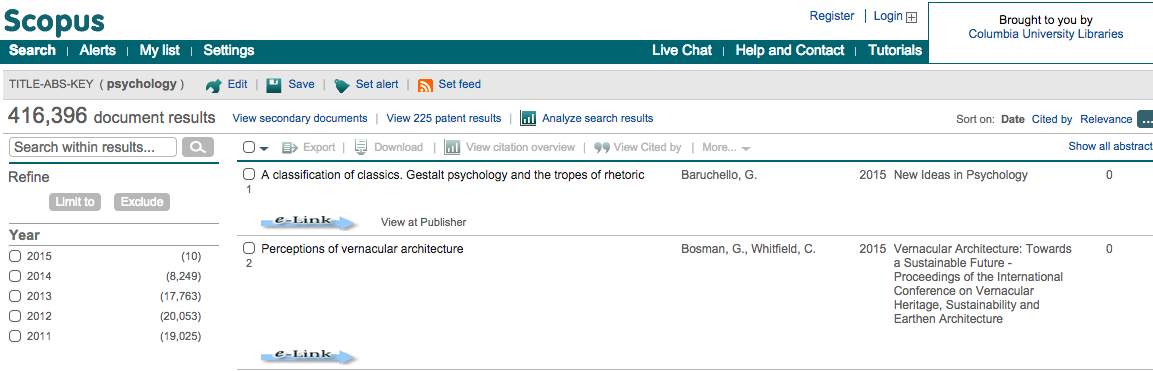
p + geom_line() + facet_wrap('TERM') + theme_bw() + ggtitle('Figure 1')
See anything weird? Let’s zoom in a bit, only focusing on search results between 1990 and 2000.
df_recent_papers = df_2[(df_2.YEAR >= 1990) & (df_2.YEAR <= 2000)]
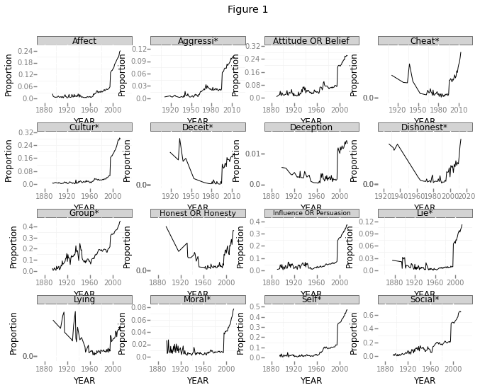
p = ggplot(df_recent_papers[df_recent_papers.TERM != 'Total #'], aes('YEAR', 'Proportion'))
p + geom_line() + facet_wrap('TERM') + theme_bw() + ggtitle('Figure 2')
This clearly shows a huge jump between the years 1995 and 1996. This is especially funny, given that these are supposed to be proportions. How could the proportion of all these search terms jump up like that? Just to double check, I plotted the total number of papers returned below.
totaldata = df_2[df_2.TERM == 'Total #'] #limit the data only to the total number of results
#I had to reset the index. Before doing this, the plot was throwing a key error
totaldata = totaldata.reset_index()
del totaldata['index']
#Now the plot:
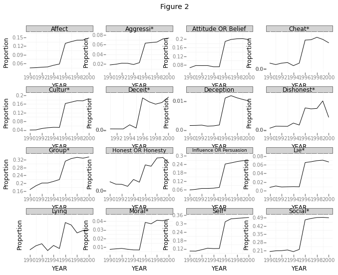
p = ggplot(totaldata, aes('YEAR', 'Number of Results'))
p + geom_line() + theme_bw() + ggtitle('Figure 3')
And once again, let’s zoom in
totaldata = totaldata[(totaldata.YEAR >= 1990) & (totaldata.YEAR <= 2000)]
totaldata = totaldata.reset_index()
del totaldata['index']
p = ggplot(totaldata, aes('YEAR', 'Number of Results'))
p + geom_line() + theme_bw() + ggtitle('Figure 4')
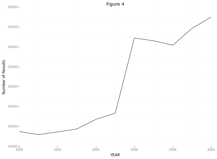
So here we’re seeing something pretty unusual. It seems that the number of papers listed by scopus jumps from about 17,000 in 1995 to about 25,000 in 1996. That’s nearly a 50% increase! I’m not sure where this sudden increase in papers is coming from - maybe a few new journals were started in 1996? Maybe Scopus doesn’t have access to some subset of papers prior to 1996? However, even if I track down the source of this jump (I hope to in a future post!), I’m still stuck with the original question which prompted this: within psychology, what topics have changed in popularity in the last few years?
Looking at Figure 1, it seems like the proportion of papers dealing with all of those topics have increased. Am I overlooking something? How is this possible?